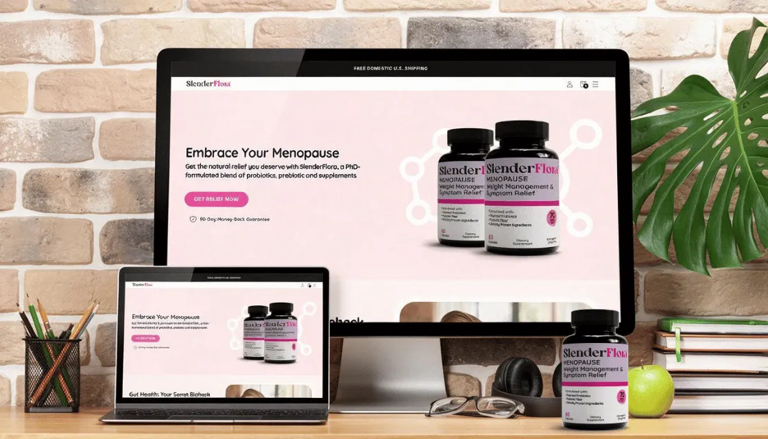
SlenderFlora makes a probiotic supplement for weight management during menopause. The formula is PhD-formulated, delivers 70 billion CFU, and is estrogen and drug free. The brief we took on covered everything a customer actually sees: a logo, a supplement label, product renders, and a Shopify store to sell it all from. The finished work is live at slenderflora.com.
The problem we were solving
Most menopause supplements look like they were designed to be hidden in a drawer. Plain white bottles, apologetic pastels, the same stock photo of a woman laughing at a salad that every brand in the category licenses. SlenderFlora’s buyer is a woman in her late 40s or 50s who wants to feel like herself again, and she has already scrolled past a hundred beige vitamin brands that talk down to her.
We pitched the brand closer to premium beauty than to pharmacy. Hormone therapy has already been offered to her and she wants another route. What she is shopping for is a version of herself she misses.
The logo
SlenderFlora is a wordmark, built on a high-contrast display serif with real thin-and-thick movement in the strokes. “Slender” sits in charcoal. “Flora” runs in magenta. The detail we like most is at the end: the “ra” in Flora flows into a single ligature, the arm of the r sweeping into the loop of the a, which reads as a leaf or a petal without ever drawing one. The tilted counter inside the “o” keeps the whole word from sitting too still.
The two-color split does the positioning work on its own. Slender is the weight promise. Flora is the microbiome science. One glance and you have the product.
The label
Supplement labels come with a fixed rulebook: the Supplement Facts panel, the ingredient list, the net quantity. There is limited room to sell, so the front panel has to do it in a few lines. The top reads MENOPAUSE, then “Weight Management & Symptom Relief.” A magenta bar divides the panel, and under it: formulated with patented probiotics, prebiotic fiber, and clinically proven ingredients, plus a magenta stamp calling out 70 Billion CFU. Along the bottom: 60 Capsules, Dietary Supplement, and “Estrogen & Drug Free.”
That last line matters more than it looks. “Hormone-free” is the product’s biggest differentiator for women who have been offered hormone therapy and want another route, but it is a claim category regulators watch closely. “Estrogen & Drug Free” says the same thing in language a compliance reviewer can sign off on.
The product renders
The bottle is glossy black with a black cap, so the label carries all the color. We rendered it on a soft lavender background with studio lighting and a soft contact shadow under the base, which gives the label its contrast and the shot its depth. Because the renders are digital, one asset set works everywhere: website banners, marketplace listings, ad creative, and the bundle cards on the product page, where the same bottle appears as a single unit, a two-pack, and a three-pack.
The Shopify store
We designed and built the storefront in Shopify around the buyer’s own language. The homepage opens on “Embrace Your Menopause” and later lands the line “Your ‘Meno Belly,’ Hacked From Within.” The product page carries the education: estrogen decline disrupts the gut microbiome, cortisol spikes, insulin and appetite hormones shift. Each mechanism then maps to what the formula does, from calming the estrogen shift to rebalancing appetite hormones. Ten benefit tiles follow, then independent clinician reviews, a three-tier bundle selector with a 90-day money-back guarantee, customer reviews, and FAQs.
Type is Uxum Grotesque for headlines with Aktiv Grotesk Light for body copy. The palette holds the brand together across every page: magenta #E5419D and deep pink #C61671 against charcoal and soft pink whites, with a teal accent reserved for trust elements like the guarantee.
What shipped
- Logo and brand identity
- Supplement label design
- Product renders, including bundle shots
- Shopify web design, homepage and product page
The store is live and selling at slenderflora.com.
 14261 SW 120th St #108-543 Miami, FL 33186
 (954)744-0890